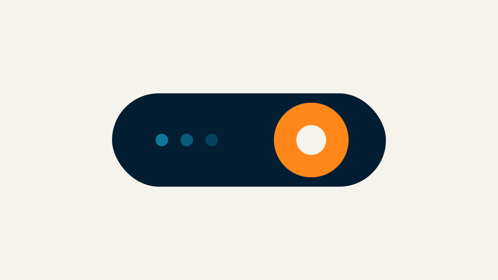
Most of a website’s personality lives in the small moments: a toggle that snaps into place, a button that acknowledges a press, a field that validates before frustration builds. These micro-interactions are brief by design, but they accumulate into a feeling of competence. When they are missing, even a beautiful layout can feel brittle and uncertain.
Micro-interactions are rising because product standards have risen with them. People carry expectations from mature apps into every marketing site and portal they visit. Orpheus designs these details as part of the system — not as last-minute polish — so engagement feels continuous instead of accidental across pages and devices. The goal is a product that feels attentive in the small moments where trust is won or quietly lost.
What a micro-interaction actually is
A micro-interaction is a contained response to a single user action or system event. It has a trigger, rules, feedback, and sometimes loops or modes. Think password strength meters, selection animations, pull-to-refresh cues, toast notifications, or a cart icon that updates quantity after an add-to-cart action. That discipline is what separates intentional product design from decorative redesigns that look new but behave the same.
The value is communication. Micro-interactions tell users what happened, what is allowed, and what comes next. Without them, interfaces feel mute. With too many of them, interfaces feel restless. The craft is matching intensity to importance so critical moments get clarity while minor ones stay quiet. Document the decision so future pages inherit the same logic instead of reinventing hierarchy each sprint.
Unlike large interactive features, micro-interactions rarely change the business model on their own. They change the quality of every minute spent in the product — which is often where loyalty quietly begins and where frustration quietly ends relationships. Revisit the pattern after launch with real sessions, because lab assumptions rarely survive first contact with busy users. When stakeholders ask for more modules, return to the primary job and cut anything that does not advance it.
Feedback is the primary job
The most important micro-interactions confirm cause and effect. Button press states, disabled styles with explanations, loading indicators, and success checkmarks all reduce anxiety. Users should never wonder whether the system registered their intent or whether they should click again. Consistency across templates matters as much as any single clever interaction on a homepage hero. Revisit the pattern after launch with real sessions, because lab assumptions rarely survive first contact with busy users.
Error feedback deserves the same care. Inline validation that appears at the right time, in plain language, prevents the dead-end of a full-page failure after a long form. Timing matters: validate early enough to help, late enough not to nag people while they are still typing carefully. When stakeholders ask for more modules, return to the primary job and cut anything that does not advance it.
Teams building digital products with Orpheus should treat feedback states as first-class design deliverables, equal to the happy-path screens that usually dominate stakeholder reviews and launch checklists. That discipline is what separates intentional product design from decorative redesigns that look new but behave the same. Revisit the pattern after launch with real sessions, because lab assumptions rarely survive first contact with busy users.
Brand personality lives in the details
Micro-interactions are one of the few places brand voice can be felt without a paragraph of copy. A precise, understated motion system feels different from a playful bounce. Sound, if used at all, should be optional and quiet. Consistency across components matters more than inventiveness in any single flourish. Consistency across templates matters as much as any single clever interaction on a homepage hero.
Document duration, easing, and amplitude in the design system so engineers do not reinvent motion on every page. When micro-interactions share a vocabulary, the whole site feels authored by one team — because it is. For related thinking on narrative cohesion, see visual storytelling in web design.
Performance and accessibility constraints are design constraints
A micro-interaction that tanks frame rate or ignores prefers-reduced-motion is a liability. Prefer transform and opacity where possible, keep durations short, and offer reduced-motion alternatives that still communicate status without relying on spectacle. Document the decision so future pages inherit the same logic instead of reinventing hierarchy each sprint. Document the decision so future pages inherit the same logic instead of reinventing hierarchy each sprint.
Focus rings, ARIA live regions for important updates, and keyboard-operable controls ensure micro-interactions do not become mouse-only theater. Accessibility is not the enemy of polish; it is the requirement that polish include everyone who needs to complete a task on your site. Keep the standard visible in critiques so teams do not trade clarity for novelty under deadline pressure.
Prioritize the moments that carry risk or effort
Not every hover needs choreography. Invest first where users spend effort or face risk: authentication, payments, uploads, destructive actions, and multi-step forms. Those moments benefit most from reassurance and clarity because mistakes are costly and confidence is fragile. When stakeholders ask for more modules, return to the primary job and cut anything that does not advance it.
Secondary delight can follow once the critical paths feel solid. A charming empty state will not save a checkout that gives no confirmation. Sequence the work the way users experience risk. If you are revisiting an existing site, audit high-friction flows before refreshing decorative motion — our UX design perspective is a useful companion to that audit.
Ship a system, then refine with observation
Create a small library of approved micro-interaction patterns — success, warning, loading, selection, expansion — and reuse them. Systems scale; one-off animations decay into inconsistency that users feel even when they cannot name the cause. Keep the standard visible in critiques so teams do not trade clarity for novelty under deadline pressure. Keep the standard visible in critiques so teams do not trade clarity for novelty under deadline pressure.
After launch, watch where people hesitate or retry actions. Those spots are candidates for better feedback, not necessarily bigger animations. Micro-interactions earn their keep when they make the product feel reliable under real use, across the messy conditions of everyday browsing. That discipline is what separates intentional product design from decorative redesigns that look new but behave the same.